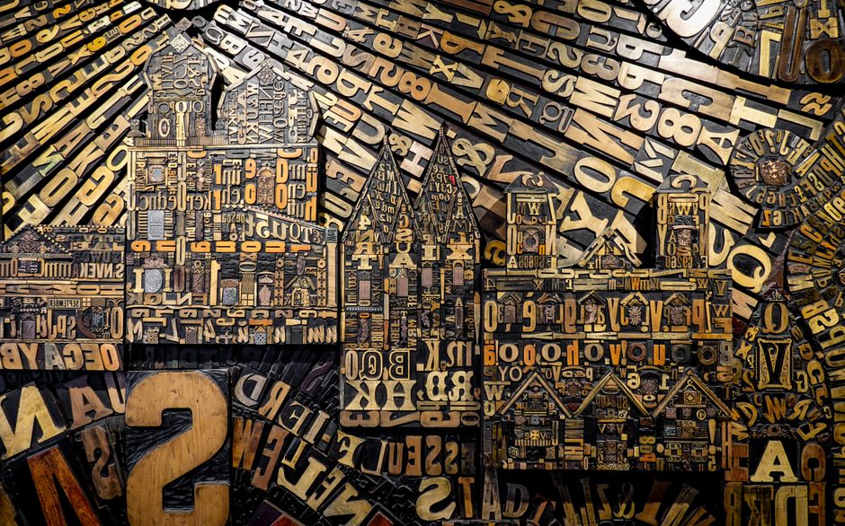
Typography Trends for Modern Websites
Typography in web design has come a long way from the days of system fonts and limited styling options. As technology advances and user expectations shift, the way we approach type on the web continues to evolve. This article explores some of the most significant typography trends currently shaping modern websites, focusing on how they align with both technical capabilities and the need for clear, accessible communication.
Designers are increasingly treating type as a core visual element rather than just a means to convey text. The rise of variable fonts, the bold use of oversized type, and a renewed emphasis on legibility are all responses to a changing digital landscape. Understanding these trends can help you make informed decisions when designing or updating your own website, ensuring that your typography not only looks contemporary but also serves your audience effectively.
Variable Fonts: Flexibility and Performance
Variable fonts have emerged as a powerful tool for web designers. Unlike traditional fonts that require separate files for each weight or style, variable fonts allow you to adjust weight, width, slant, and other attributes dynamically within a single file. This flexibility offers significant advantages in terms of file size and performance, as fewer HTTP requests are needed to load the same range of typographic options. For websites that rely on multiple typefaces or weights, variable fonts can streamline the loading process and improve overall user experience.
Beyond performance, variable fonts open up creative possibilities. Designers can fine-tune the type to fit specific contexts, such as adjusting letter spacing or weight for different screen sizes and resolutions. This adaptability is particularly valuable in responsive design, where typography must scale gracefully across devices. By using variable fonts, you can ensure that your text remains readable and visually engaging whether viewed on a smartphone, tablet, or desktop display.
However, it’s important to consider browser compatibility and implementation details. While most modern browsers support variable fonts, older versions may not. Testing across different environments ensures that your typography falls back to an appropriate alternative if needed. Additionally, using variable fonts effectively requires a thoughtful approach to the design system. Establishing clear guidelines for when and how to vary the font properties can prevent visual inconsistency and maintain brand coherence.
Oversized Type: Making a Bold Statement
Oversized type has become a defining trend in modern web design. Large headlines not only capture attention but also create a strong visual hierarchy. They can turn a simple message into a memorable brand statement, guiding users through the page and emphasizing key content. When used intentionally, oversized type can transform the aesthetic of a website, giving it a contemporary and confident feel.
The effectiveness of oversized type lies in its ability to communicate quickly and concisely. In an era of short attention spans, bold typography can convey the essence of a page at a glance. It also provides an opportunity for creative expression, allowing designers to experiment with letterforms, spacing, and layout. From full-screen hero sections to striking section headers, oversized type can set the tone for the entire site.
Yet, there are practical considerations. Oversized type can cause readability issues if not carefully implemented. It can also disrupt the visual balance if used excessively. To mitigate these challenges, designers often pair oversized headings with more restrained body text, creating a contrast that guides the eye. Additionally, using responsive techniques to adjust the size of the type based on viewport dimensions ensures that the oversized effect translates across devices without breaking the layout.
Focus on Legibility: Balancing Aesthetics and Function
While bold typefaces are stylish, legibility remains a cornerstone of effective web typography. Legibility refers to how easily individual characters can be distinguished, while readability encompasses the ease of reading extended text. Both are essential for user experience, especially for content-heavy websites. Modern trends in typography consistently integrate legibility into the design process, ensuring that aesthetic choices do not compromise comprehension.
Factors such as font size, line height, line length, and letter spacing significantly influence legibility. For body text, a font size of at least 16 pixels is commonly recommended, and line heights of 1.5 or more help guide the eye. Line length should be controlled to prevent overly long or short lines, which can strain the reader. Similarly, appropriate letter spacing prevents characters from appearing cramped or disjointed, especially in uppercase or large display text.
Another aspect of legibility is the contrast between text and background. Sufficient contrast is crucial for users with visual impairments or when viewing on low-quality screens. Web Content Accessibility Guidelines (WCAG) provide specific contrast ratios to aim for, and modern design tools often include contrast checkers. By prioritizing legibility, you demonstrate a commitment to inclusive design, making your website usable for a wider audience.
Typography in Responsive and Mobile-First Design
With the majority of web traffic now occurring on mobile devices, responsive typography has moved from a nice-to-have to a necessity. Responsive typography means that font sizes, line heights, and spacing adapt to the viewport, ensuring that text remains readable and visually pleasing across all screen sizes. This approach often involves using relative units like rem or em, rather than fixed pixel values, so that text scales proportionally.
Mobile-first design takes this a step further by designing for the smallest screen first and then enhancing the experience for larger screens. This philosophy forces designers to prioritize essential content and simplify layouts. When it comes to typography, this often means using larger font sizes on mobile to compensate for the smaller screen, while increasing line height and reducing line length to maintain readability. On desktop, there is more room for flexibility, allowing for more elaborate type treatments.
Fluid typography, which uses calculations to adjust font size continuously based on the viewport, offers a sophisticated solution. This technique can eliminate the need for breakpoints, creating a seamless scaling experience. However, it requires careful testing to ensure that the type does not become too large or too small at any viewport size. Incorporating fluid typography into your responsive strategy can provide a polished and consistent user experience.
Voice and Tone: Typography as Brand Expression
Typography is a powerful tool for conveying a brand’s personality and tone. The choice of typeface, weight, and styling can evoke specific emotions and associations, aligning with the overall brand identity. For example, a serif font might suggest tradition and elegance, while a sans-serif font often feels modern and clean. Script fonts can add a personal touch, but they are best used sparingly for accents rather than body text to maintain legibility.
In modern web design, there is a growing trend towards using custom fonts that are tailored to a brand’s unique identity. This can involve commissioning bespoke typefaces or licensing distinctive fonts that are not widely used. Custom typography helps differentiate a brand from competitors and reinforces its message. However, it’s important to balance uniqueness with accessibility. If a font is too obscure or difficult to read, it may alienate users and detract from the user experience.
Finding the right voice through typography requires a deep understanding of the audience and the brand’s values. Designers often create a typographic scale that defines the range of styles and sizes used across the site, ensuring consistency and harmony. This system can guide decisions about when to use bold, italic, or other variations, allowing the type to support the content without overwhelming it.
Typography is not just about selecting fonts; it’s about crafting a visual language that speaks to your audience. The choices you make can either clarify or confuse, so it’s essential to approach typography with intention and care.
Future-Proofing Your Typography Approach
As web technologies continue to evolve, so will typography. Keeping an eye on emerging trends and developments can help you future-proof your website. One such development is the increasing support for advanced font features, such as ligatures, small caps, and tabular figures, which can enhance the quality of your typography. Additionally, the growing popularity of color fonts and variable fonts hints at a future where typography is even more expressive and flexible.
Another important consideration is the use of system fonts versus webfonts. While system fonts offer guaranteed performance and consistency, they lack the distinctive personality of webfonts. Using a hybrid approach, where you load webfonts with a fallback to system fonts, can provide the best of both worlds. This ensures that your site remains functional even if the webfont fails to load, and it maintains a reasonable load time.
Ultimately, the key to successful typography is thoughtful design and continuous testing. By aligning your typography with your brand’s goals and your audience’s needs, you can create a website that is both visually appealing and highly functional. As trends shift, your approach may evolve, but the fundamentals of legibility, hierarchy, and brand consistency will always remain relevant.